As I browsed GameFAQs, searching for these images, a revelation occurred to me. Final Fantasy IV is probably the most re-released game in the long-running series. That’s a fitting fate for it too. It was perhaps the major title to usher in the “golden age” of Japanese role-playing games. At the very least, it was the first game in the series that hinted at the forward momentum Square would have over the next decade-and-a-half with the genre. So, why don’t you join me as I explore the covers Square used to sell the game over the years.

The first thing I noticed when looking at the original box art Square used for FFIV is the lack of emphasis placed on Yoshitaka Amano’s artwork. The previous three games featured his renderings of warriors and princesses prominently. This go around though, you’d think he was relegated to the logo only. This wasn’t the case though; Square simply chose to highlight a different aspect of the character designs – the super deformed! It’s cutesy for sure and plasters some common job classes upfront, and I guess I like that they took a different route with it. Oh, and there’s Kain Highwind in Amano’s logo.

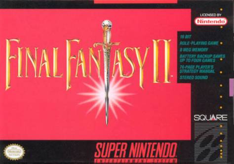
When they released it in America for the SNES a year later though, the American branch didn’t even try. It’s simple and it always catches my eye when I scour local game shops for good deals. Maybe it’s not so bad; it does catch my eye after all. They really had to pitch it to us though, didn’t they? They’ve got bullet points on the front of the box! It was released over here as Final Fantasy II since the second and third titles weren’t. This prevented much confusion. And releasing a dumbed-down version prevented much difficulty.

The game was first rereleased for the PlayStation in 1997. The Japanese box art sees a return to the styling’s of Amano. Cecil Harvey and Golbez are prominently featured, although honestly, it’s hard for me to distinguish the rest of the imagery, and even if that really is Golbez and not Kain. Regardless, Kain takes his place in the logo. Cecil definitely fronted a hair metal band before being cast for FFIV. The PlayStation version was released in America too, circa 2001. It was bundled with Chrono Trigger and released as Final Fantasy Chronicles. There’s not much else to mention about the box art.

Little known to many Western gamers, Bandai had a fortuitous deal with Square to rerelease Final Fantasy titles for their WonderSwan and WonderSwan Color. FFIV was released for the WSC in 2002. A decadent airship is featured in the background that was no doubt crafted by the illustrious Cid Pollendina.

FFIV would next see release on a Nintendo platform again – the Game Boy Advance. It was released as Final Fantasy IV Advance in Japan and America in December 2005, and six months later in Europe. The Japanese box art is simple. Gray silhouettes of Cecil and Kain flank the logo. Meanwhile the American and European release is much more colorful. These versions feature Cecil and Kain, as well as Rosa Farrell for the first time. The box art used for these regions hints at the love triangle between the cast. This is definitely Amano refining the “wispy lines” he’s known for.

A few years later, the game saw a full-scale remake into 3D. Originally released for the Nintendo DS in Japan in December 2007, it was released in the back-half of 2008 in America and Europe. It has since been released for mobile devices running iOS and Android systems as well, but those platforms don’t really have boxed games… Japan received another Amano box art, featuring a larger portion of the cast, including the Lunar Whale. Here in America, we received an ominous black box, which formed a holographic Golbez. Europeans received the same essentially. The only difference was the color palette.

Finally, FFIV was bundled together with Final Fantasy IV: The After Years and an interlude bridging the two titles as Final Fantasy IV: The Complete Collection. This was released for the PlayStation Portable in 2011 and was the version I played. I think Japan and Europe got the better box art with this release. A large portion of the cast is done in emotive poses, painted in a watercolor style very reminiscent of Amano’s work on the original three games in the series. America on the other hand received gray silhouettes of Cecil and Kain against a white background. This version was very reminiscent of the Japanese release of Final Fantasy IV Advance.

With a brand as strong as Final Fantasy, the box art doesn’t have to sell the game. This might explain why Square has felt the liberty to rerelease Final Fantasy IV with a multitude of different covers. With much variety for this one game, it’s hard to pick a single favorite. I really like the Japanese and European release of Final Fantasy IV: The Complete Collection. It’s probably the easy favorite. All of Amano’s artwork is awe-inspiring personally. Heck, the Super Famicom release is cool too, in a differentiated cutesy way. I’ll go with my easy favorite though – the Japanese and European releases of The Complete Collection.
Haha, that’s pretty cool! I didn’t know there were so many versions of FFIV!! I think the very first Super FamiCom version is my personal favorite.
LikeLike
What’s interesting is they’re not simply rereleases either. The differences aren’t major between them but there’s some incentive to check out more than one version.
LikeLike
Definitely. I remember hearing they added a new dungeon or something to the GBA (Maybe it was DS?) version. That’s pretty cool too. I’ve played the Complete Collection as well as the original SNES versions only. Kind of one end to the other, yeah? Haha.
LikeLike