I’m going to skip over posting about the box art for Pokemon Colosseum as there wasn’t much difference between the various regional releases. Gyruss on the other hand, so a handful of releases in the early eighties. Parker Brothers published the early home versions and used the above box art for these releases. Those looking to play a home conversion of the Konami arcade shooter were in luck if they owned an Atari 2600, 5200, Coloecovision, Atari 8-bit computer, or a Commodore 64. The cover depicts a triangular space station. Perhaps these are the satellites that surround the power-ups in the game?
The next set of home conversions came courtesy of Konami themselves. Released for the Famicom Disk System in Japan and the NES here in America, this box art evoked the stage progression of the game. Many planets are ahead of our starship pilot and there’s even the attention to detail noting the tubular nature of the gameplay. Very impressive! The FDS box art is practically the same and can be seen as the featured image to this post, kind of.
And that’s pretty much it for home conversions of Gyruss. It has been featured on a few arcade compilations published by Konami, but they don’t do those too often. Beyond those, it was released onto Xbox Live Arcade very early in the Xbox 360’s lifespan. This was a pure emulation of the original arcade game with little distinguishing features. Gyruss appears to be a game that hasn’t won over a lot of people. Regardless, it’s a stupendous golden age arcade game.
Okay, Final Fantasy V hasn’t been released as much as its predecessor. In fact, the first time it was officially released outside of Japan was with the American release of Final Fantasy Anthology for the PlayStation. That was in late 1999 – basically seven years after it was originally released on the Super Famicom in late 1992. It took another two and a half years for the game to eventually be released in Europe. Since then, it has been released on the Game Boy Advance and on iOS and Android platforms.
Looks familiar, no?
As they did for the Super Famicom release of Final Fantasy IV, Square opted for a cutesy cover over the traditional usage of Yoshitaka Amano’s artwork. Again, he was relegated to the logo design. This cover hones in on the wanderer Bartz, and easily conveys this fact. The logo chosen for this game includes a dragon intertwined with the font. This is also apt as dragons play a significant role in the narrative.
Of the covers Final Fantasy V has been released with over the years, this is my favorite.
The game was subsequently released on the PlayStation in 1996. This is my favorite cover that’s been used for one of the game’s releases. The cutesy character design again reigns supreme and this time it’s highlighting the many job classes. With the exception of two as there were twenty-two job classes in the original.
This is the version I have. It also includes Final Fantasy VI, which I will dive into soon.
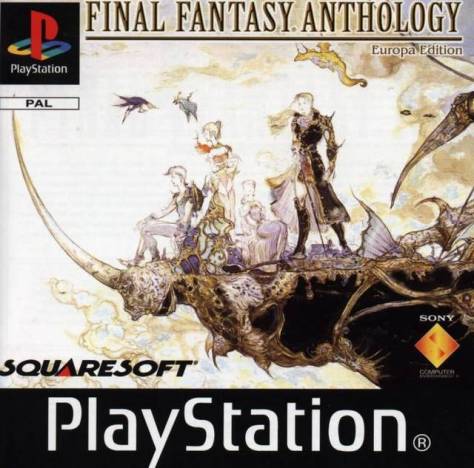
So this is the version of the game that I possess. I really dig the box art, but it pertains to Final Fantasy VI, so it’s not really comparable in this article. I will mention that I had difficulty playing the disc on the PlayStation 3. There is a save screen glitch that the game freezes at. The glitch is still a factor when playing the disc on the PlayStation 2, but on that system, it’s only a graphical glitch. The menu can still be navigated and the game doesn’t freeze.
The European version includes Final Fantasy IV instead of Final Fantasy VI.
For the European release of Final Fantasy Anthology, this game received the honor of selling the game. If it’s successor was included in this package, I’m sure that wouldn’t have been the case. Still, this is prime Amano displaying the cast on one of the many ships.
The Japanese release of the GBA version.
For the Game Boy Advance release, a slew of extra content was added including extra job classes and an extra dungeon or two. I’d like to play these versions of the NES and SNES titles (excluding 3 which never saw an Advance release). The Japanese release included a lot of negative space, yet still left room for Amano’s character designs.
This cover was used for the American and European releases.
The cover used for the American and European releases however did away with that negative space and really zoomed in on the characters. Plus the large GBA banner on the left-hand side takes up much space.
Just as the case was with Broken Sword: The Shadow of the Templars, this game has been released on many digital platforms that don’t really have box art. As I mentioned above, I prefer the box art for the Japanese PlayStation release. It’s different enough from the rest to stand out, and the cutesy design works well when displaying the many job classes.
I learn something new everyday. Sometimes the information is useful, other times its video game trivia like the fact that Broken Sword: The Shadow of the Templars was originally released as Circle of Blood in America.
Thanks to MobyGames for having the only moderate box art for the original American release. Too bad it has their watermark on it.
The first time the game was released at all, it was released as Circle of Blood in America. I don’t care much for the stained glass box art. It doesn’t hint at the mystery as well as the European box art does. One could ascertain the game takes place in Europe thanks to the stained glass visage and the gargoyle, but it just doesn’t do it for me. Although, I would like to win a trip to Paris…
The most commonly used box art for the game.
This box art was used for the European releases of the original PC version and the PlayStation and Game Boy Advance ports. As I mentioned earlier, I feel the collage used and the menacing man on the cover hint at the mystery of the narrative quite well.
The first good American box art for the game.
For the American release of the PlayStation port, THQ (R.I.P.) chose to utilize a crucial in-game item. The Templar manuscript that George and Nicole locate fuels their journeys for the latter half of the game and uncovering what each section symbolizes was a major narrative driver.
Undoubtedly similar to the European box art.
When BAM! (R.I.P.) published the GBA version in America, they opted for a cover that had more in common with the European cover. And yes, I’m only saying that because of the leering eyes. Although, this is the only box art that features a broken sword. Not that it’s important or anything; it didn’t really factor into the narrative until very late in the game, and even then, in a minor way.
Umbrella Corporation?
The first director’s cut of the game appeared on the Nintendo Wii and DS. The American releases of the games shared the same box art and featured an ancient looking symbol of the Knights Templar. I’ve always had a soft spot for this box art; perhaps because it was a notable “exclusive” for the Wii back in the day.
The more modern European box art.
Finally, the European release of the director’s cut for the Wii and DS ventured away from the traditional European box art. Like it’s American counterpart, it uses color tones that hint at age, but in general it hints at the mystery of the game as it’s European predecessor had.
And of course, the game has since been released on countless digital since the director’s cut was debuted on the Wii and DS. There’s not really a suitable image to show for these as they lack proper box art. The icons they use generally seem to include a head shot of Nicole since she is featured more prominently in the director’s cut release. I like all of the covers well enough with the exception of Circle of Blood. The original European cover is my favorite at this point.
As I browsed GameFAQs, searching for these images, a revelation occurred to me. Final Fantasy IV is probably the most re-released game in the long-running series. That’s a fitting fate for it too. It was perhaps the major title to usher in the “golden age” of Japanese role-playing games. At the very least, it was the first game in the series that hinted at the forward momentum Square would have over the next decade-and-a-half with the genre. So, why don’t you join me as I explore the covers Square used to sell the game over the years.
A cutesy move away from the previous games’ covers.
The first thing I noticed when looking at the original box art Square used for FFIV is the lack of emphasis placed on Yoshitaka Amano’s artwork. The previous three games featured his renderings of warriors and princesses prominently. This go around though, you’d think he was relegated to the logo only. This wasn’t the case though; Square simply chose to highlight a different aspect of the character designs – the super deformed! It’s cutesy for sure and plasters some common job classes upfront, and I guess I like that they took a different route with it. Oh, and there’s Kain Highwind in Amano’s logo.
Objects as letters! Not as bad as numbers as letters.
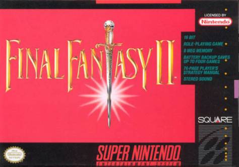
When they released it in America for the SNES a year later though, the American branch didn’t even try. It’s simple and it always catches my eye when I scour local game shops for good deals. Maybe it’s not so bad; it does catch my eye after all. They really had to pitch it to us though, didn’t they? They’ve got bullet points on the front of the box! It was released over here as Final Fantasy II since the second and third titles weren’t. This prevented much confusion. And releasing a dumbed-down version prevented much difficulty.
Back to Yoshitaka Amano.
The game was first rereleased for the PlayStation in 1997. The Japanese box art sees a return to the styling’s of Amano. Cecil Harvey and Golbez are prominently featured, although honestly, it’s hard for me to distinguish the rest of the imagery, and even if that really is Golbez and not Kain. Regardless, Kain takes his place in the logo. Cecil definitely fronted a hair metal band before being cast for FFIV. The PlayStation version was released in America too, circa 2001. It was bundled with Chrono Trigger and released as Final Fantasy Chronicles. There’s not much else to mention about the box art.
Bandai? You mean the company that collaborated on the Apple Bandai Pippin?
Little known to many Western gamers, Bandai had a fortuitous deal with Square to rerelease Final Fantasy titles for their WonderSwan and WonderSwan Color. FFIV was released for the WSC in 2002. A decadent airship is featured in the background that was no doubt crafted by the illustrious Cid Pollendina.
Simple.
FFIV would next see release on a Nintendo platform again – the Game Boy Advance. It was released as Final Fantasy IV Advance in Japan and America in December 2005, and six months later in Europe. The Japanese box art is simple. Gray silhouettes of Cecil and Kain flank the logo. Meanwhile the American and European release is much more colorful. These versions feature Cecil and Kain, as well as Rosa Farrell for the first time. The box art used for these regions hints at the love triangle between the cast. This is definitely Amano refining the “wispy lines” he’s known for.
Less simple, but I prefer it!
A few years later, the game saw a full-scale remake into 3D. Originally released for the Nintendo DS in Japan in December 2007, it was released in the back-half of 2008 in America and Europe. It has since been released for mobile devices running iOS and Android systems as well, but those platforms don’t really have boxed games… Japan received another Amano box art, featuring a larger portion of the cast, including the Lunar Whale. Here in America, we received an ominous black box, which formed a holographic Golbez. Europeans received the same essentially. The only difference was the color palette.
The DS covers.
Finally, FFIV was bundled together with Final Fantasy IV: The After Years and an interlude bridging the two titles as Final Fantasy IV: The Complete Collection. This was released for the PlayStation Portable in 2011 and was the version I played. I think Japan and Europe got the better box art with this release. A large portion of the cast is done in emotive poses, painted in a watercolor style very reminiscent of Amano’s work on the original three games in the series. America on the other hand received gray silhouettes of Cecil and Kain against a white background. This version was very reminiscent of the Japanese release of Final Fantasy IV Advance.
The PSP covers.
With a brand as strong as Final Fantasy, the box art doesn’t have to sell the game. This might explain why Square has felt the liberty to rerelease Final Fantasy IV with a multitude of different covers. With much variety for this one game, it’s hard to pick a single favorite. I really like the Japanese and European release of Final Fantasy IV: The Complete Collection. It’s probably the easy favorite. All of Amano’s artwork is awe-inspiring personally. Heck, the Super Famicom release is cool too, in a differentiated cutesy way. I’ll go with my easy favorite though – the Japanese and European releases of The Complete Collection.
I really like video game boxes. Barring any previous knowledge about a specific game, they can make or break an impression. Having edited a lot of information on Giant Bomb in the past and thanks to my general encyclopedic tendencies to research video games, I enjoy seeking out the different covers that were used for video games in regions other than the United States. The Resistance series has had many variations for the primary trilogy, and even for the two handheld games, that I want to post about.
This is a game you can judge by its cover.
The series’ initial release was a fairly standard first-person shooter and it’s box art isn’t eye-catching. It’s grayish palette is boring, and then you notice that isn’t a human skull. One thing that I really like about the series’ logos, is the use of landmarks related to the game’s setting. In this incarnation, Big Ben (officially known as Elizabeth Tower) defines the A. With the exception of various rating labels, this box art was used in all regions.
Grrr, me gruff man with weapon on video game box.
Resistance 2 saw Insomniac Games adopting the “scale and Hale” approach, and it most definitely traded on a larger scale and included more depth to Nathan Hale than Fall of Man. The box art is fairly representative of this although some might say it’s a little generic thanks to the image of Nathan brandishing a gun. The background conveys a lot on the flip side. For this release, the Golden Gate Bridge defines the A.
Insomniac released a few alternate covers through the PlayStation Blog, this was the first one.
A few alternate covers were released through the PlayStation Blog for fans to print off and replace the original Resistance 2 cover if they desired. The first one didn’t alter much. It features a zoomed in Nathan, perhaps better conveying his Chimeran traits visible by his eyes.
This was the second alternate cover released through the PlayStation Blog.
This is the second alternate cover released through the PlayStation Blog and I really like it! I think it’s more eye-catching than the cover used and foreshadows the duality in Nathan’s half-human, half-Chimeran traits. This is also true for America, before and after the Chimeran invasion.
Japan’s box art for Resistance 2 removed Nathan and piled on the Chimera.
Finally, Japan received a different box art for their release of the game.This one conveys a little more of the futile nature of the human-Chimeran conflict that I surmised present in the game’s narrative.
Olly Moss’ artwork is fantastic and it’s too cool that he was commissioned for this game.
And with Resistance 3, Insomniac and Sony went a completely different direction. Without a doubt, it’s more “artsy” than any other Resistance cover. A visit to Olly Moss’ website proves he has a definitive style that harkens back to periods past, and his design was somehow fitting for the final game in the trilogy. Defining the A this time is the Statue of Liberty.
For the trilogy compilation, Olly’s artwork was utilized again.
There have been two compilations of the series thus far. A dual pack release that bundled the first and second games together and an actual compilation that featured all three games. The North American box art isn’t really noteworthy. it features the basis of Fall of Man’s box art with some stickers stating what it is. This cover however was utilized for Europe and Australia and is much, much cooler.
The two differing box arts for the PSP game.
The first spin-off for the series was Resistance: Retribution for the PlayStation Portable. From most accounts, it’s a stellar game that isn’t as hindered by the PSP’s lack of a second analog stick. I haven’t played it myself, although I’m looking forward to it. Both covers feature the Eiffel Tower prominently. The left-hand box art was used in America and Japan and is similar to the second game’s while the right-hand one was used in Europe and Australia and reminds me of Japan’s cover for the second game. With this title, the Eiffel Tower defines the A.
Wow Japan, very cool!
The most recent, and likely final, game in the series is Resistance: Burning Skies for the PlayStation Vita. It was generally received negatively, but I’m still moderately interested in it. The North American and European cover implies a violent end for the Chimera in question while also highlighting the occupation of the protagonist. The Japanese box art is oddly colorful and I’m really drawn to it. Defining the A for the final time is Tom Riley, the game’s firefighter star.
The series has had a fair amount of diversity in the various covers but one thing always remained constant: Chimera. Dead or alive, they were always present.
Share this:
Twitter
Facebook
Tumblr
Like this:
LikeLoading...
The internet's source for Mansion of Hidden Souls.

 Parker Brothers published the early home versions and used the above box art for these releases. Those looking to play a home conversion of the Konami arcade shooter were in luck if they owned an Atari 2600, 5200, Coloecovision, Atari 8-bit computer, or a Commodore 64. The cover depicts a triangular space station. Perhaps these are the satellites that surround the power-ups in the game?
 The next set of home conversions came courtesy of Konami themselves. Released for the Famicom Disk System in Japan and the NES here in America, this box art evoked the stage progression of the game. Many planets are ahead of our starship pilot and there’s even the attention to detail noting the tubular nature of the gameplay. Very impressive! The FDS box art is practically the same and can be seen as the featured image to this post, kind of.